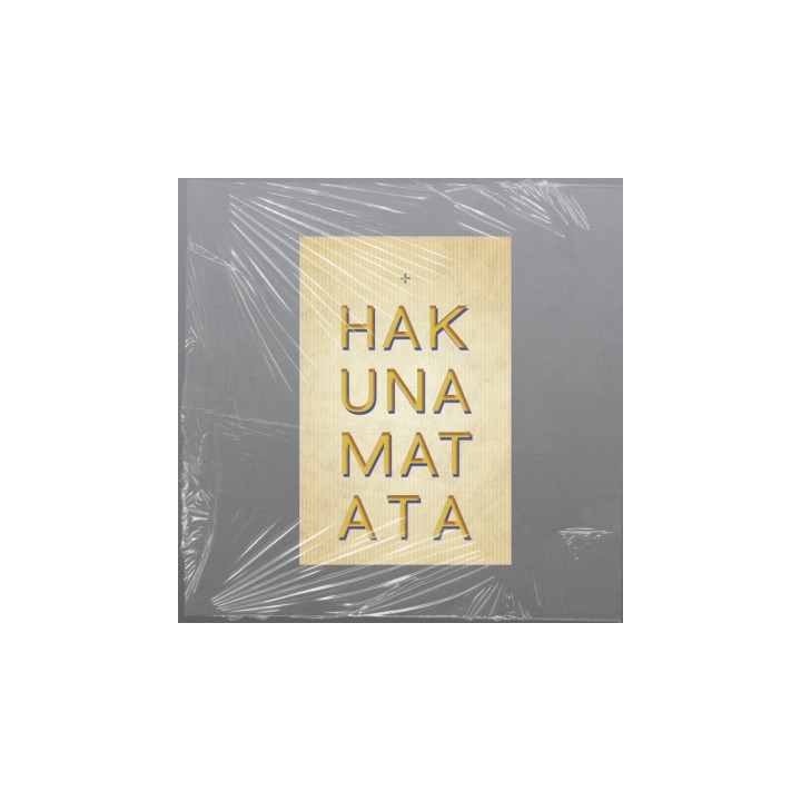
A clean, vertical typographic layout presents the phrase “Hakuna Matata” in bold gold lettering against a textured neutral background, giving it a calm yet striking visual presence.
 Secure Shopping
Your data stays private and protected.
 Fast & Reliable Delivery
Orders ship quickly with trusted carriers.
 Easy Returns & Exchanges
Return items within 30 days, stress‑free.
This layout takes a minimalist but impactful approach to showcasing the well‑known phrase “Hakuna Matata.” The words are split into four stacked segments — HAK, UNA, MAT, ATA —creating a rhythmic, column‑like structure that draws the eye downward in a steady flow. Each segment is rendered in bold, gold‑toned lettering with a subtle shadow, giving the text a sense of depth without overwhelming the design.
The background is a soft, textured beige that adds warmth and a natural, tactile feel. Its understated tone allows the gold typography to stand out clearly while maintaining an overall sense of calm and balance. At the top, a small gray plus sign sits centered above the text, acting almost like a quiet visual anchor or decorative accent, as the many first QROFTIES had these for reconaisance.
The combination of vertical alignment, muted colors, and strong typography creates a layout that feels modern, serene, and confident. It captures the spirit of the phrase — ease, simplicity, and a worry‑free mindset — through a design that is both visually appealing and emotionally resonant.

check_circle
check_circle

